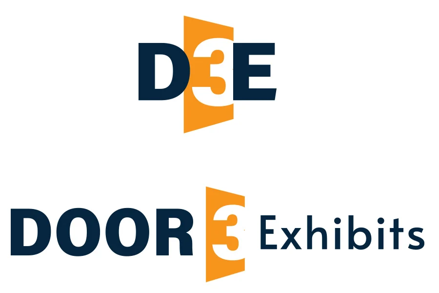
This client needed a sleek logo that truly represented the exhibit design he was capable of creating. Through an extensive logo exploration, we landed on this sleek solution with an integrated door mark that doubles as an emphasis to the number 3. The colors were chosen to feel mature but modern with a little bit of energy from the bright orange contrasted against the navy blue.
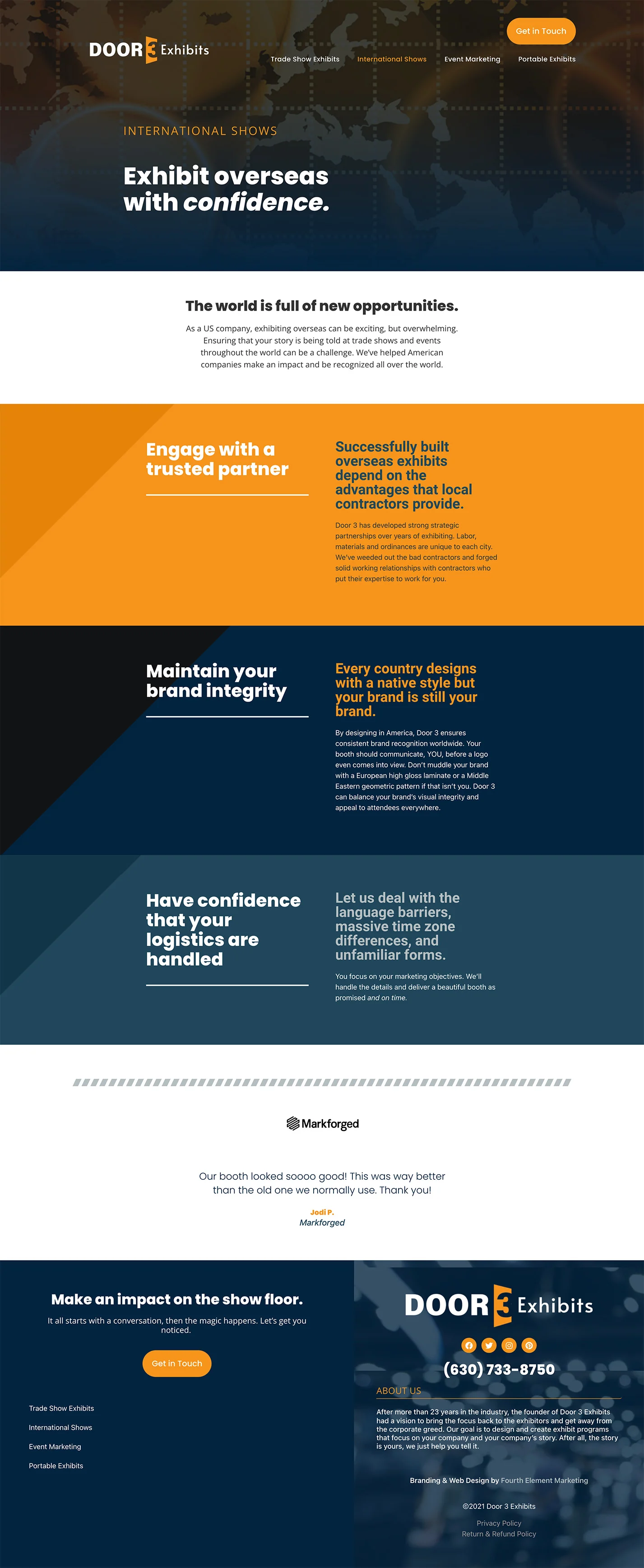
Website Design & Development
Built on WordPress, this responsive site is a simple brochure site with clear call to actions. As a new company, they didn’t have many portfolio pieces so we worked in ways to give the vibe of what they can do while showcasing the couple projects they had.